Savr Recipes
A Modified Google Venture Design Sprint
OVERVIEW
Savr recipes is a start-up that makes it easier for individuals to follow their favorite recipes wherever they are. I was tasked with running a design sprint to quickly test out new solutions to make recipes easier to follow and execute due to negative reviews on complicated recipe instructions.
This design sprint took place during my design program at Springboard.
ROLE
Redesigned the recipe user journey, working closely with my mentor to improve the design solution
TIMELINE
1 week
TEAM
Sole UX Designer
The Problem
Many Individuals have difficulty executing new recipes due to complex and unclear instructions. The goal is to help users accurately and easily follow cooking instructions
The Solution
Redesigned the Savr recipes mobile app to provide users with easier-to-follow recipe instructions. Newly incorporated features include:
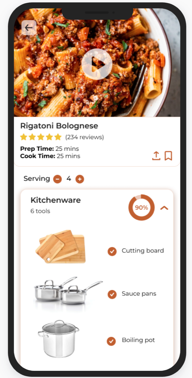
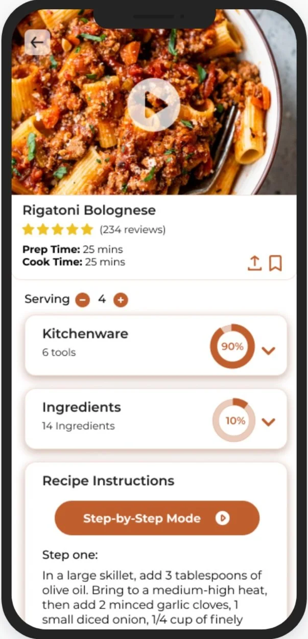
Communicated all prep information before the recipe
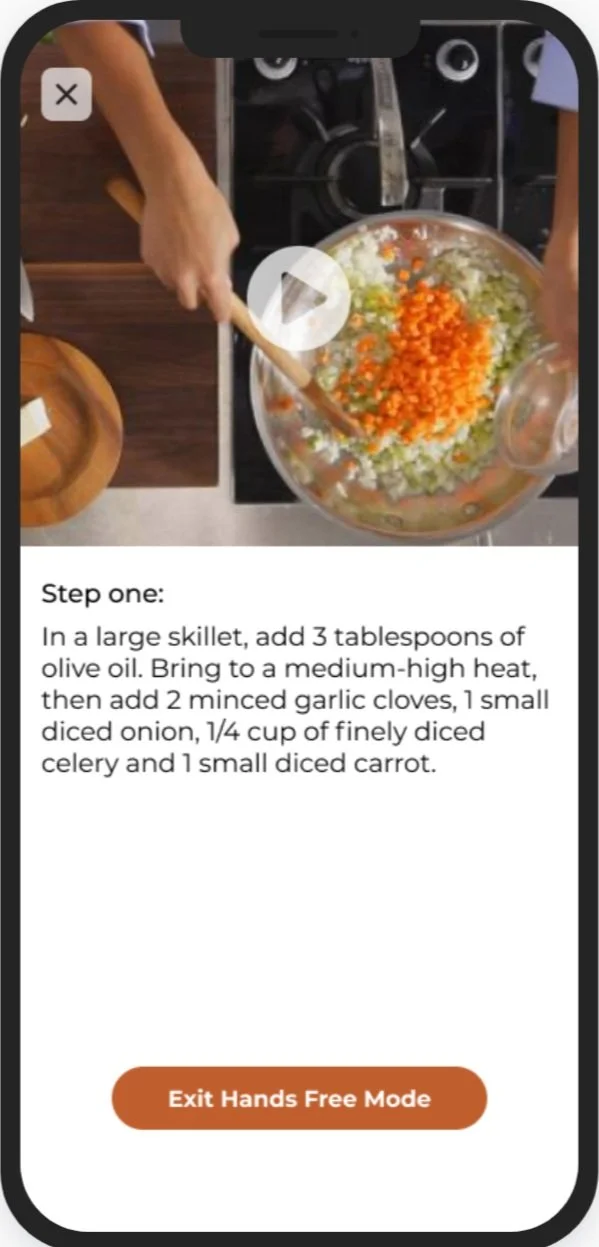
A step-by-step guide accompanied by visuals to limit recipe confusion
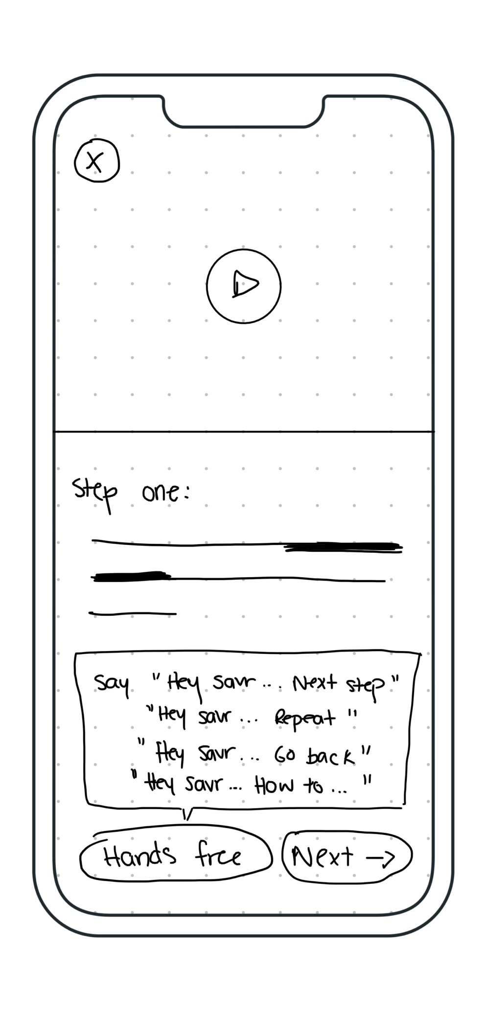
A voice-activated Hands-free mode
Mini tutorials for extra assistance during complicated recipes
DAY ONE: UNDERSTANDING THE PROBLEM
The Research
Before beginning the design sprint, design constraints were set in place to remember. More specifically, I had to:
Assume that all recipes are written out from start to finish in text
Design a solution as a feature for the Savr recipe app
Focus on creating a better user experience for those looking to cook new recipes
I began the sprint by first going through research previously conducted by Savr on Savr recipe users. Identifying user pain points and needs helped better design a solution. I gathered all the information and synthesized them through affinity mapping and concluded on three major pain points.
Prep: users wished to have all prep information readily available before beginning a recipe
Unclear Instructions: due to complex recipes, users feel unsure about how to complete certain steps
Timing: users want to avoid stress and rushing when completing a recipe
Pain points pulled out through Affinity Mapping
How Might We…
After reviewing the research material provided by Savr, I came up with three “How Might We” questions that address each pain point to reflect on throughout the design process.
How might we help users feel prepared before beginning a recipe?
How might we provide users with step-by-step instructions that are easy to understand and follow?
How might we make recipes easy and efficient to follow in order to save time and limit stress?
Meet Nick: The Persona
Mapping the User Journey
With the research insights in mind, I created an end-to-end experience map that can give users a better recipe experience.
DAY TWO: SKETCHING
Lightning Demos
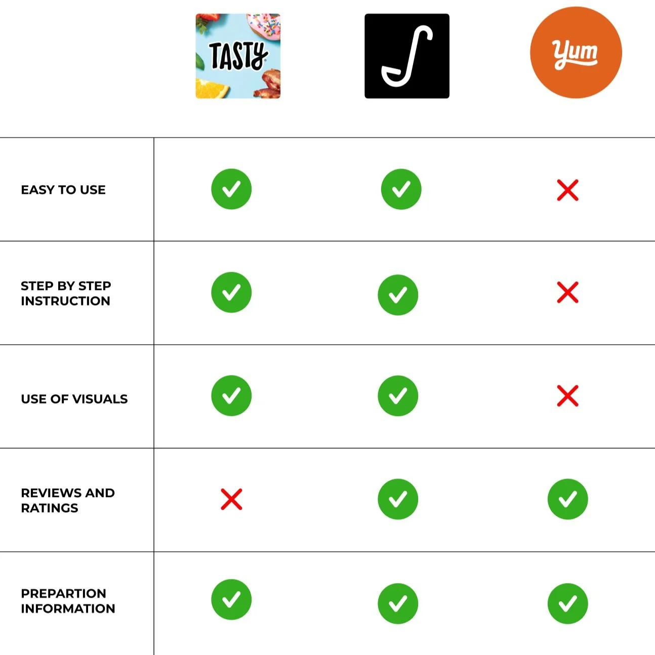
Before sketching possible solutions, I conducted a solo lightning demo to seek inspiration on three popular apps within the same category: Tasty, Yummly, and Sidechef.
This process allowed me to recognize familiar design choices for the three chosen apps. An important takeaway I took from this was that the use of visuals such as video tutorials allows for better user understanding when executing new recipes. Users can easily visualize new techniques and limit their confusion and mistakes when cooking something new.
Competitive Audit of Tasty, Sidechef and Yummly
Sketching Out a Solution
I utilized the Crazy 8’s method to produce quick design solutions to this problem. During this process, I focused on designing the recipe page as the critical screen initially due to it causing the most frustration. From this, I was able to choose sketch #2 as the best design option out of the 8 based on how many pain points it addressed, and how logical the screen layout was.
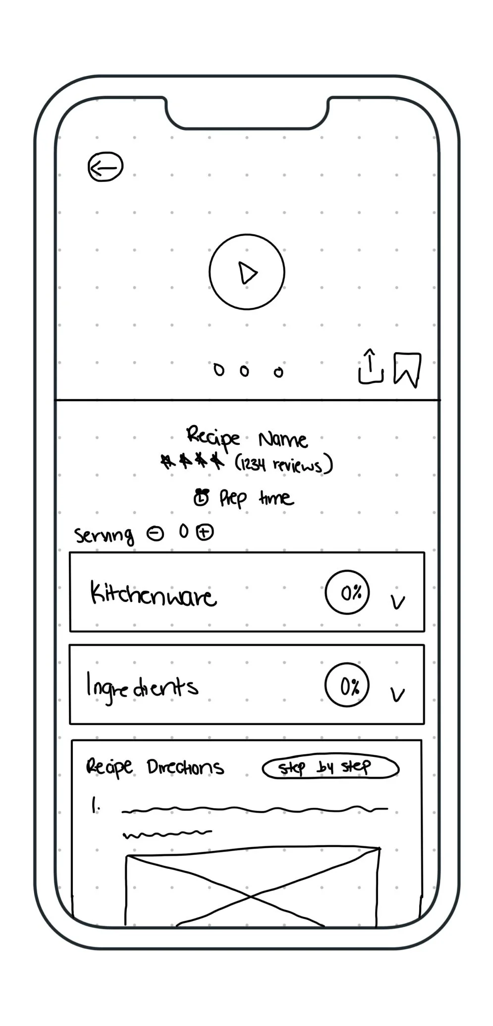
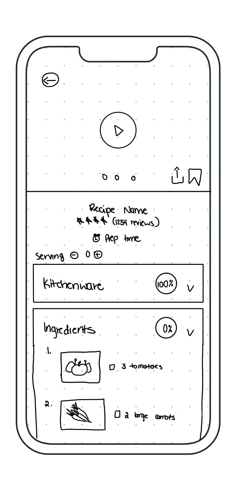
I wanted all the recipe information to be presented in a consecutive manner, beginning with the recipe visuals, followed by its preparation information, and lastly the step-by-step recipe. The idea was to provide users with all the necessary information in the most organized way to avoid confusion and constantly referring to their phones.
My Crazy 8’s Sketches
DAY THREE: DECIDE
Storyboard Wireframes
After choosing sketch #2 as the best option out of the 8, I drew a panel of sketches to help visualize the rest of the user journey through the app before and after completing a recipe. Because the problem was that users had difficulty executing recipes, I made sure to focus most of my attention on the journey of completing a recipe rather than just finding one.
For this design, visuals are the most prominent UI element because they can provide users with better assistance during their recipe. Visuals are included in the step-by-step guide, but also within the kitchenware and ingredients list to better prepare users. In addition, because users stated to have difficulty knowing what certain steps mean or how to execute them, I made the decision to add overlays for mini tutorials for complicated cooking steps/skills.
A voice-activated hands-free feature was also added to the design to help limit the need for users to continuously grab their phones when cooking.
DAY FOUR: PROTOTYPE
Prototyping the Design
To stay true to the design sprint time constraint and to avoid moving off a linear track, I constantly referred back to my storyboard screens. When designing, I wanted the Savr recipe screens to feel familiar and easy to use, especially when compared to its counterparts in the recipe/cooking category. The goal was to create a simple but effective design that was eye-catching but very functional.
The recipe and tutorial content was created by Dina from Simply Home Cooked
In terms of color, I adjusted the orange brand color: FF8D32 into a deeper color: BF5F2D to better adhere to WCAG accessibility standards.
DAY FIVE: TESTING
Usability Testing
To validate my design solution, I recruited 5 participants for a 1:1 moderated usability test to seek out information on how users felt, especially in terms of how easy it is to follow a recipe. Individuals from these tests were people who had experience making new recipes as well as enjoyed cooking.
The majority of the feedback was positive with 5/5 users stating that it was easy to follow and understand because of its simple layout. They appreciated having the option to go hands-free when completing a recipe and liked having all the important prepping information laid out with visuals before starting the recipe.
On the other hand:
2 out of 5 users expressed the option to have different units of measure for ingredients (i.e. US vs metric.) because they were unfamiliar with what certain measurements meant.
3 out of 5 users wished that they could have the option to go back and forth between steps.
1 of the 5 users wished to have a progress bar to help them visually understand how long their recipe will take as they execute it.
Based on this feedback, I iterated the design to include some of the suggestions made during the test to better the user experience.
Conclusions and Reflections
Overall this design sprint allowed me to create a solution to better help users follow new recipes at home.
Despite the time constraint, this project allowed me to understand how to prioritize and time manage certain design decisions over others in order to create the best solution. If I could go back, I would take the time to further conduct usability tests and iterate.


