nook
Product / UX Design & Research
OVERVIEW
Nook is an e-book startup company that provides users with access to a wide range of books, both locally published and in the public domain. After two years of being a free product and gaining a strong user base, Nook is looking to upgrade its features to encourage users to upgrade to the paid (premium) product.
ROLE
Created improvements to the Nook user experience to help convert freemium users to premium. Conducted competitive research, established user flows, and produced low and high-fidelity prototypes.
TIMELINE
4 weeks
TEAM
Sole UX Designer and Researcher
The Project
About Nook
After two years, Nook has finally gained a strong user base through its free product but is now looking to upgrade its features to promote users to upgrade to the paid (premium) product.
From the project brief, I was provided with the following information:
Business goals 📈:
Create the opportunity for new users to subscribe to the premium product upon registration
Create the opportunity for returning free users to upgrade to premium through the sign-in flow as well as within the product (once signed in)
Important information from the product manager 📝:
The current sign-up flow does not have a CTA that provides users with an opportunity to subscribe to premium - nor does it have frequent CTAs throughout the app experience to promote upgrading
By creating a paid product through a user subscription fee, users can enjoy better features than the free experience - but also allow Nook to earn a profitable revenue stream
Target audience 👥:
18-24 years old
Very tech-savvy
Very budget conscious
Reading plays an important role in their daily lifestyle
The Solution
A bold and hip e-book and audiobook mobile experience that offers users a wide range of book titles that are locally and popular best-selling novels.
Discovery
Learning from Industry Standards
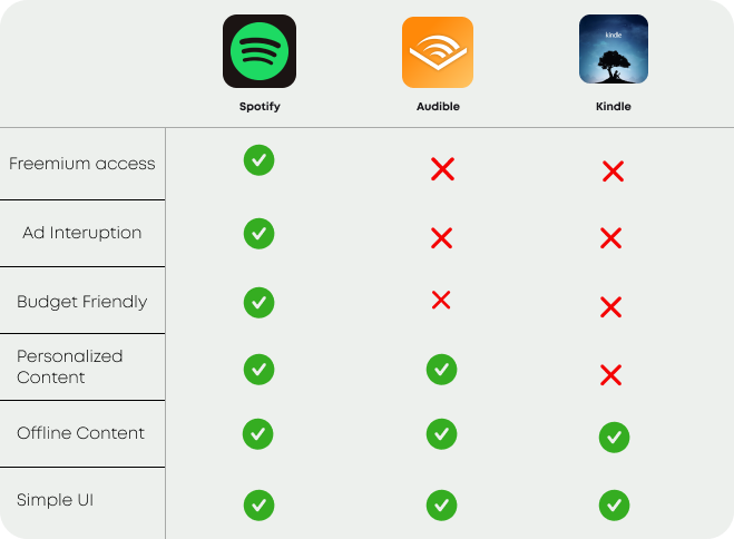
In order to better understand the media streaming industry - especially for e-books and audiobooks, I studied 3 leading companies within the book and music industry in order to understand their approach to monetizing their product. During this, I examined their sign-up flow, as well as their conversion pushes. In addition, I compared its features and functionality to pinpoint consistencies within each app. Synthesizing the competitive analysis made it easier for me to recognize patterns that existed within each app, especially in terms of what works and what doesn’t when it comes to promoting users to subscribe to premium.
Competitive audit of media industry features and functions
The User Journey
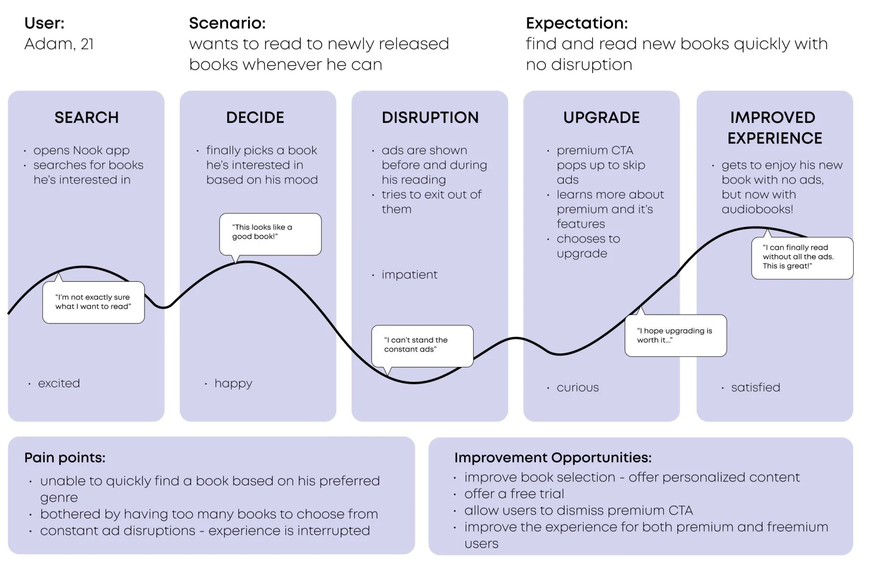
I took the next step of establishing the user journey map with the industry standards in mind.
Constructing the journey map allowed me to visualize the interactions and frustrations that users may encounter when using the platform. The Nielsen Norman Group Journey Map was used as a reference and guide when creating this.
With the established customer journey map, I broke down the Nook e-reader experience through the use of a user flow. This flow helped ensure that all business goals were addressed, as well as that all pathways through the app were clear and easy to navigate. I wanted to make sure that I highlighted the routes that allowed users to easily upgrade to the premium when they desired, but to also make sure that the freemium experience was just as great for those that did not want to upgrade.
User Journey Map
Low Fidelity Designs
From the competitive analysis and defined flows, I developed wireframes using the company-provided wireframes as a backbone.
The initial wireframes provided by the company lacked sufficient detail and were over-simplistic and did not meet the majority of its business goals. I addressed the notes that were provided and altered the design of the wireframes to not only acknowledge the company’s goals but to also showcase industry standards.
The Company Wireframes
The Redesigned Wireframes
The Style Guide
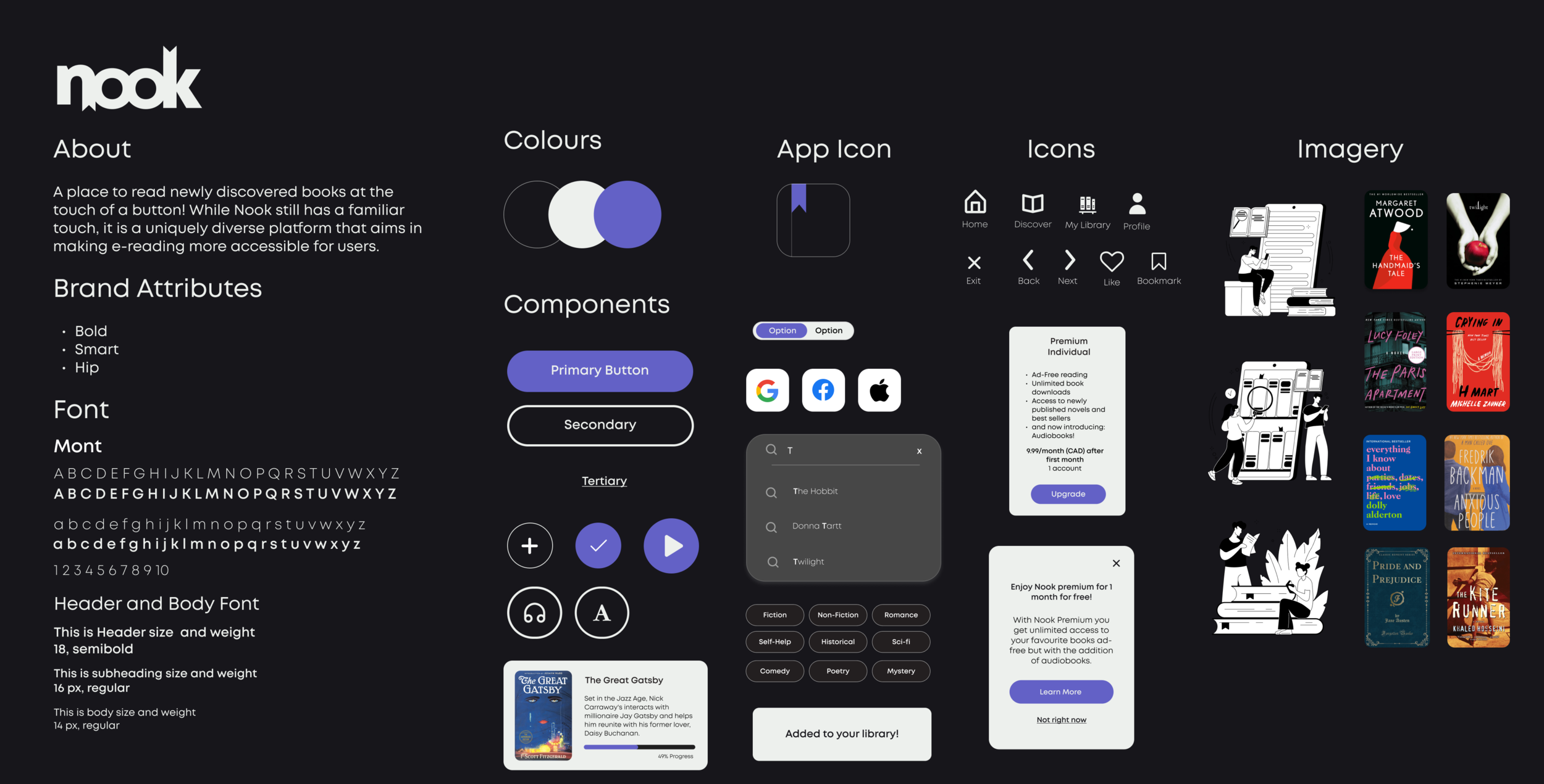
When it came to high-fidelity screens, the revised style guide demonstrates Nook’s bold, smart and hip branding that also adheres to WCAG principles. This style guide was chosen to demonstrate Nook’s uniqueness but to also allow users to feel comfortable when interacting with the app. The dark mode design of Nook was inspired by popular media industry leaders such as Spotify and audible.
I also created various components to help enhance micro-interactions within the app - especially when reading a book on Nook.
Testing and Validation
The high-fidelity prototype was tested among a different set of five individuals that fit within the target customer group.
The goal of this test round was to 1) identify concerns and frustrations when navigating through the app and 2) understand how users feel about the content organization and UI design of Nook.
Fortunately, the feedback provided by users revolved mostly around content organization rather than navigation and usability concerns. Users had little difficulty navigating through the app, as well as engaging with both freemium and premium versions of Nook. Based on the feedback provided by the 5 user testing participants, I iterated on my design and improved on 3 major concerns that users faced.
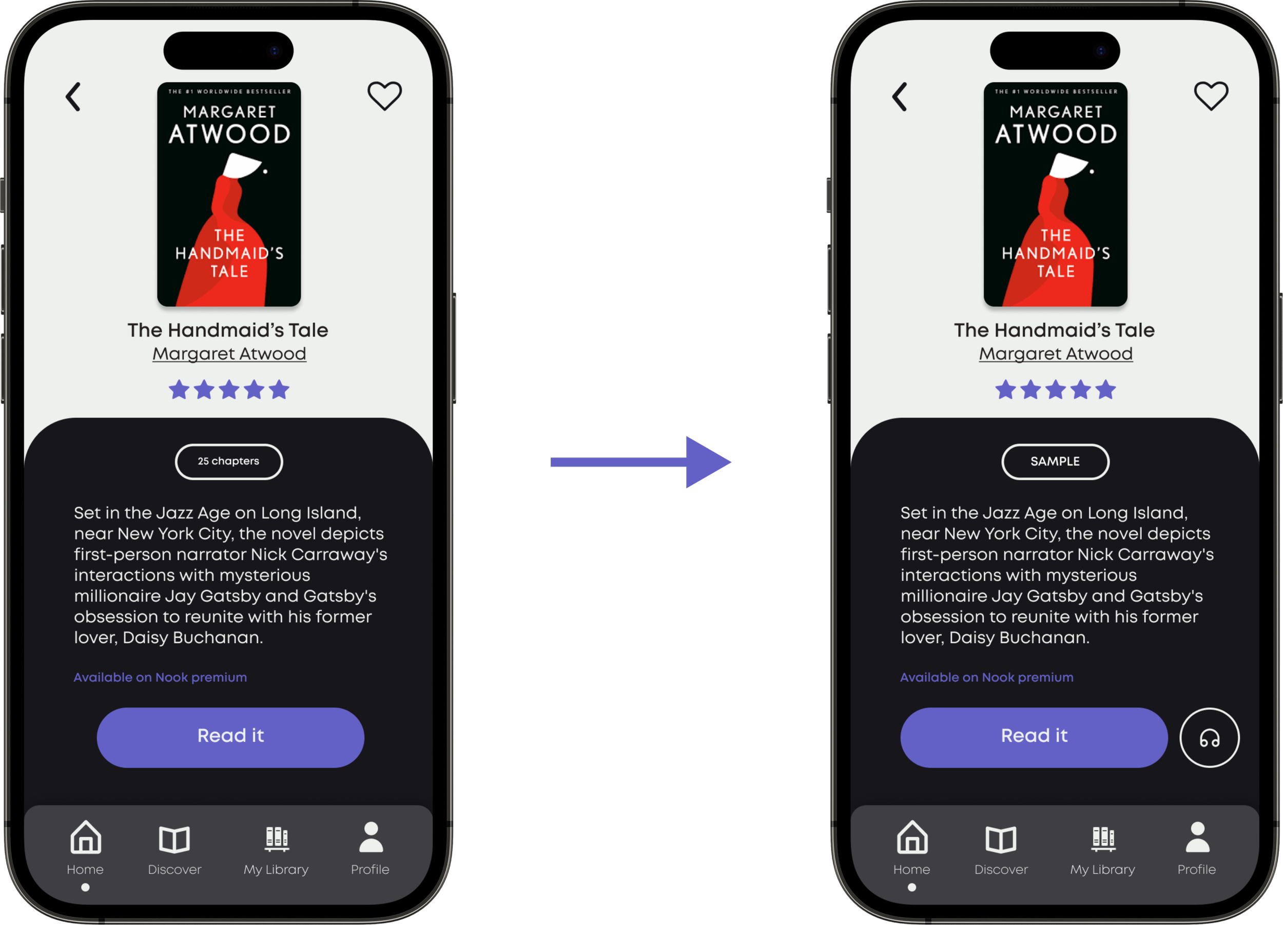
Audiobook CTA: While participants enjoyed having the option to listen to an audiobook while reading, 2/5 participants believed they would make better use of the audiobook feature if it were to have a CTA button that would allow users to listen offline - away from reading.
Design Change: provide users with a clear CTA button on the title page that allows them to listen to their audiobook offline.
Clearer instructions: In the onboarding process, users are encouraged to choose their favorite book genres through sliding components. However, 3/5 participants were unaware that they could slide to view other genres.
Design Change: provide users with clear instructions on how to interact with this screen in order to avoid confusion.
Sample Reading: Each book title was accompanied by information on how many chapters are in the novel. However, 4/5 participants felt that this function had little to no function to them and suggested they have a sample button instead.
Design Change: provide users with a sample reading CTA that can allow them to access a small portion of the book they want to read.
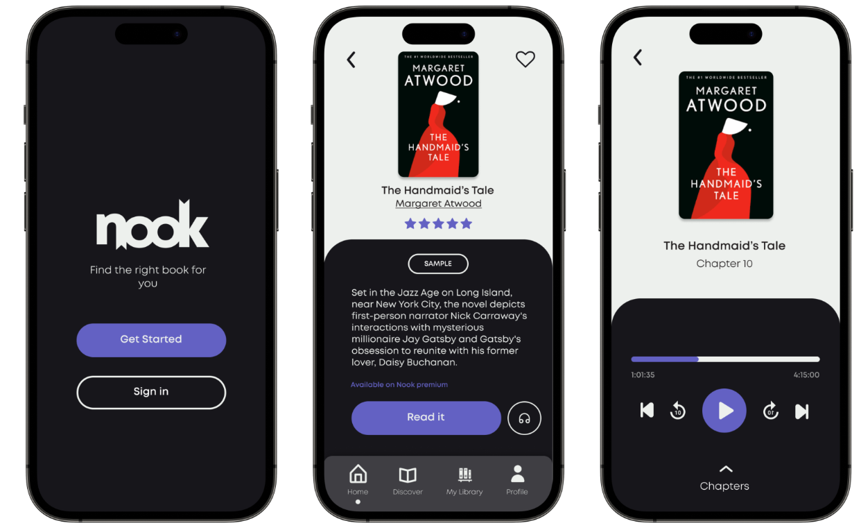
The iteration: Final Nook Design
A bold and hip e-book and audiobook mobile experience that offers users a wide range of book titles that are locally and popular best-selling novels.
Nook’s new mobile design accomplishes its business goal by offering users a premium subscription to their content that includes the new additional feature of audiobooks. The premium subscription plan allows Nook to build a profitable revenue stream.
While this product has not been shipped, 5/5 of user testing participants believed that they would upgrade to the premium version of Nook.


Lessons Learned and Reflection
Creating balance: it was really important to create a balance in converting users to the paid product, as it's quite easy for users to feel bothered by constant ads and interruptions that disrupt their user experience. Users value using apps that are simple and familiar and are more likely to make financial decisions when CTA is less intrusive and repetitive. In order to maintain the user experience for the freemium product, it was key to not limit all features - as the free version is what promotes users to want to upgrade.
Dark Mode Design: Working with a dark style guide could have gone in the wrong direction if I did not try my best to adhere to WCAG standards. I wanted to create a style guide that felt fun, but also provided users with a comfortable visual experience when reading their new reads. The choice of using purple was to enhance the bold aspect of Nook.
Continuous Upskilling: Sometimes when working on new projects, you encounter learning and working with new circumstances that can either make or break your design decisions. I challenged myself to learn new interaction design skills and understand business processes that could help make Nook’s experience feel legitimate when compared to its media industry counterparts. Based on testing participants and mentor feedback, I would say it went well!
If I had more time,
I would continuously iterate on the mobile experience by adding new features such as a social aspect that allows users to share their current reads and reviews.
I would create a responsive design - how would this look on a tablet, or a computer desktop? Would the premium features be altered or stay the same?


