Share Scoops
UX Research & Design
OVERVIEW
Share Scoops is a company that aims in empowering the next generation of investors with the tools they need to understand, follow, and hold corporations accountable. Building off of the success of their first project, share scoops asked our team to help dive further into research and testing for their beta mobile app in order to improve the user experience.
ROLE
Worked alongside a design team of 4 as a UX Designer/Researcher to help gather research (heuristic evaluation), user testing, and possible design solutions in low and high-fidelity prototypes.
TIMELINE
4 Weeks
TEAM
Krissy X
Baiqin X
Tyler B
THE PROBLEM
Share Scoops came to us for a continuation of their research and testing for their beta mobile app. To be more specific, they wanted to understand whether their onboarding and overall app experience was working in the way that they intended without user confusion.
THE SOLUTION
We presented to Share scoops possible design solutions based on the feedback provided from user testing that also aligned with their existing design. As a team, we made use of the existing design system but implemented improvements for the onboarding process, the home page, as well as the company page in order to provide users with a more cohesive and understandable user experience.
THE KICKOFF
The project began with a kickoff meeting where we got to familiarize ourselves with the product and go over the project plan. Since the project is still within its beta stage and working to go public, there was a strict timeline constraint that we had to follow in order to make sure we completed everything in a timely manner.
For our first task, we were asked to complete an evaluation of the beta app in order to understand its scope in terms of the design and overall user experience. During this, each member went through the user journey of Share scoops to highlight its design strengths and weaknesses for both IOS and android.
Based on the 10 usability heuristics, some key takeaways I found important to consider that impacted the user experience of the app were:
Visibility of System Status: upon entering the homepage of Share Scoops, there lacked information on how users should interact with the app, leading new users to figure out where to go next on their own - creating confusion.
Consistency and standards: During the user sign-up, users are promoted to create their password on a second page, rather than on the same page with the rest of their sign-on information. This created a cognitive load because it did not follow the industry standards that most users are used to.
Aesthetic and Minimalist Design: While Share Scoops does have an eye catching colour palette and layout, there were at times UI inconsistencies that impacted its ability to have a great design, examples include the company page with the extremely large CEO image, or the journey page that was mapped out like an island. This greatly impacted the way information was presented.
Following the completion of our evaluations, our supervisor and CEO of Share Scoops requested we create an itemized list of all bugs/errors that we found for the developer to fix in order to make the beta app’s user experience smooth and unobstructed. This first task was held as a high priority due to the company aiming to open the beta to the public within the upcoming months. Therefore, I took on the role of organizing an itemized list using Figma of all the features we believed needed improvement based on our heuristic evaluation. We agreed to place each feature on a critical (greatly impacts user experience), major (could improve user experience), and normal scale (doesn’t impact but would be great to have).
The Journey Page with Annotated Evaluation Notes
The Share Scoops Sign up Page
The Homepage Page with Annotated Evaluation Notes
THE RESEARCH
Following the itemized list, it was time for us to research and test new users to help us understand how they felt about the design and its functionality. In particular, we wanted to primarily test users on their experience during the onboarding process, the homepage, and the company page. The 6 moderated user interviews (2 of them conducted by me) provided insight into how we can make users feel better equipped when interacting with this new mobile app.
As a team, the research was synthesized through empathy mapping and a prioritization matrix to help the group establish a clear vision of what our goals for the redesign were. Our findings were organized based on the pages we tested: the onboarding process, the homepage, and the company page.
Some key pain points addressed by users from this testing were:
The Onboarding Experience:
6/6 users exhibited pause and confusion around the scale of “Financial Confidence”
While the topic selection page was straightforward, 4/6 of users were overwhelmed by the number of topics available to select
2/6 users expressed confusion around the selection of companies as they were highlighted with black - which isn’t a typical indicator of success
How Might We: provide an easier onboarding experience that limits cognitive load?
Signing Up
5/6 users expressed confusion during the password creation process - felt that it was unnecessary to have the password on a separate page. In addition, users weren’t clear on the password requirements due to the password input coming up as an error state before the user completes
3/6 Users addressed that the form fields felt cramped and a bit too similar to the primary button on the page
How Might We: provide users with a signup process that feels familiar and is consistent with industry standards?
The company page
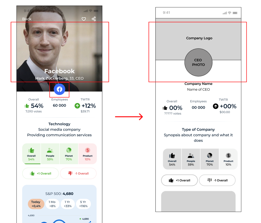
Participants believed that the CEO photo was too large and visually distracting from the company information.
How Might We: create less visual distraction for users when interacting with the company page?
The Initial Company Page
The initial Sign Up Page Text Fields
The Initial Onboarding Screens
THE REDESIGN
Based on the usability tests, as well as the initial project screens, we got to work on the wireframes. We decided to divide the work in order to better make use of time, so I took the task of designing the company page screen according to the user feedback. The main issue users faced with the page revolved around visual distraction/clutter and organization.
Resizing the CEO Image and Company logo: Participants felt that the image of the CEO was too large and at times distracting. The approach I took to solve this problem was by altering the size and focus of the CEO photo and company logo in order to limit visual distraction away from the company content.
Company Information: Participants felt that the information presented about the company was too overwhelming and chaotic - this impacted their ability to make use of the content. I chose to improve on this by placing the information into subcategories, thus making it easier for users to pick and choose what they wanted to read.
Redesigned Wireframes of the Company Page
HIGH FIDELITY SCREENS
We presented the proposed redesigns to our supervisor in order to get his feedback and approval to move forward. I made adjustments to the low-fidelity design in order to align with the expectation and feedback provided by our supervisor. In particular, because Share Scoops has no control over how the company image data is presented, the header image has to remain in square dimensions. I took this into consideration by making the company logo fit in a square dimension, while the CEO photo stayed the same in the redesign.
Redesigned Wireframe
Proposed Hi-fidelity
Final Design
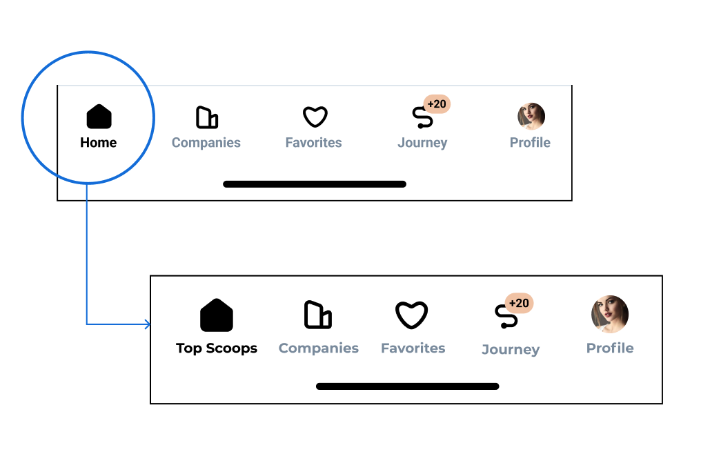
During the high-fidelity design process, I made sure to refer to the original Figma file of the initial project in order to stay consistent with our redesign. We made adjustments to the UI, specifically with text fields, and certain components. In addition, I improved upon the navigation bar due to the initial design being too small, with each icon being less than the recommended 44px for touch targets. The title for “home” was also converted to “Top Scoops” as a way to help users better understand what to expect from the page when they interact with it.
Revamped Navigation Bar
DEVELOPER HANDOFF
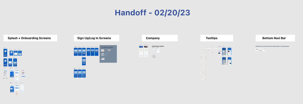
In order for the developer to easily understand our designs, it was important that we clearly presented them. I made sure to review the flow of each redesigned screen with its accompanying components to easily visualize the page interactions without needing to view the prototype. Arrows and notes on interaction states were used to give context in order to reduce the uncertainty that the developer may have when viewing the design.
LESSONS LEARNED AND REFLECTIONS
This project provided me with the opportunity of working with a great team. Through this, I learned the importance of collaboration, communication, and adaptability. Working with a diverse group of individuals with different skills and backgrounds and perspectives allowed me to expand my own understanding of how I approach design and problem-solving. It was also great to see how our collective efforts came together to create an improved user experience for Share Scoops.
Some key takeaways from this experience were:
The Importance of Communication: We had to keep each other informed about our progress, ideas, and any issues that arose throughout the project. By doing so, we were able to collaborate effectively and make informed decisions together.
Being Adaptable: Working within a fast-paced environment forces you to learn the value of being adaptable, as we had to pivot our approach to a design multiple times during the project to better align with the goals and needs of Share Scoops.
If I worked on a similar project in the future or was still working with Share Scoops, I would:
Ensure that everyone on the team has a clear understanding of the project’s goals and timelines from the outset. This would help to minimize any confusion or miscommunication throughout the duration of the project.
Prioritize taking breaks and stepping back from the project when necessary, as I found that doing so allowed me to come back with fresh eyes and new ideas
Overall, my time working on this project with my team and Share Scoops was a valuable and rewarding experience. I look forward to applying the lessons I learned to future projects and continuing to grow and develop as a designer.


